This kitchen has undergone a fairly dramatic transformation. The renovation consisted of a new layout of the space; as well as new flooring, cabinetry, appliances, counters, backsplash, lighting, sink and faucet, etc. I like how the new look came together, adding white cabinetry and butcher block ...
Read MoreBEFORE & AFTER: KITCHEN SIDE DOOR
In my kitchen there is a side entry with a charming old door. I wanted to make this a functional area – an extension of the kitchen with the BBQ and a small porch off of this side of the house.
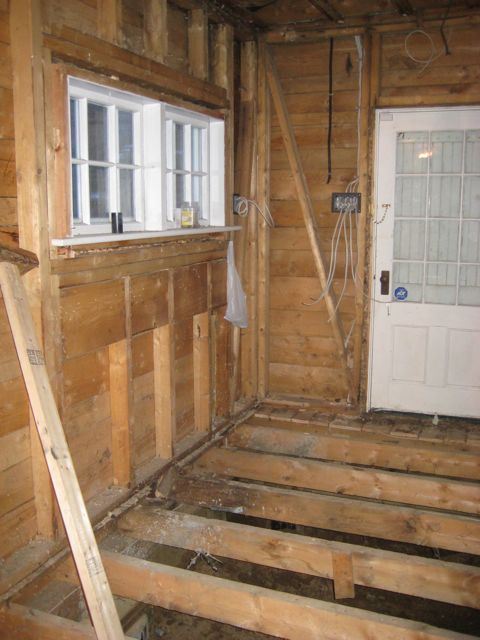
I wanted to keep the original door (I even have the old skeleton key for it), but pretty well everything else around it changed. You can see it here in the “before” picture – this is pre-renovation.
At this stage there was a wall to the right and a sink on the left with a washer. There was a drop ceiling, the floors were uneven and the great views at the back of the house weren't visible.
When the renovation started and the place was being gutted, opening up the wall on the right hand side made a huge difference to the light in the house.
This end of the house required some structural underpinning so the floors were actually completely removed as that work was done from the inside and outside of the house.
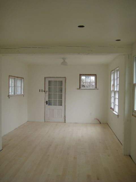
Then came a new subfloor, beams, wiring and insulation. Bigger changes are visible after the new drywall is up. Things start to feel like a house again!!
Finally the new floors are in and the cabinets and counter go in back here. There is a coat closet, pantry and the two chairs in front of the window. The sun rises here and there’s an ocean view out the window, so it’s a great place to sit in the morning.
WATERWORKS KITCHEN & BATH
When I was recently in NYC I spent some time at the Waterworks showroom. Their products are beautiful and have a classic, timeless look. They do an un-lacquered brass finish that starts off as quite a regular looking brass but quickly ages into a gorgeous patina. Here is an un-lacquered brass faucet "new" and "after" one had been in the showroom for awhile. The Waterworks line is expensive, but they have an online shop that offers some great looking pieces at more affordable prices.
Before
After
KITCHEN APPLIANCES: BLACK RANGE
I've noticed a few kitchens with really beautiful, oversized black ranges and range hoods. They create a definitely focal point in a kitchen especially when they're in a kitchen with white cabinets or counters. I find they look striking and create a distinct style and the black range hood is a statement. Here are a few of my favourite looks. Often they are made by Viking, Bertazzoni and a few other brands. Love the shot of this actress in her gown cooking. I like the black and brass combination.
A more traditional kitchen.
It can also suit a much more modern kitchen.
Image source: 1: Domino magazine 2. Domaine Home 3 & 4. unknown
DESIGN INSPIRATION: KITCHEN CABINETS
When I was planning my kitchen renovation, it took me a long time to decide on the kitchen cabinets. I have lower cabinets everywhere, and open shelves at the end of the kitchen but not many upper cabinets. I went back and forth on white lower cabinets versus a medium grey colour on the lowers only – I really couldn't decide. In the end I decided on white and the results are above. And here is another shot looking towards the dining room.
But in my kitchen inspiration file there were a lot of kitchens with darker lower cabinets, here are some of my favourites!


