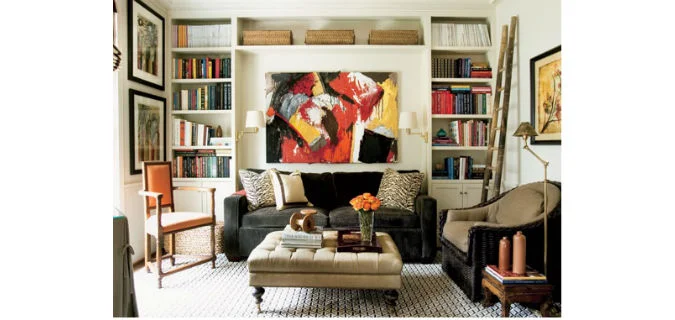
In my 'Ask Deb Nelson' column I was asked about painting built-in cabinets. We're used to seeing built-in's in a warm white, cream or ivory colour, like in the room above. Typically it's done to coordinate with the trim and other accents in the room ...
Read MoreASK DEB NELSON: ADDING STORAGE
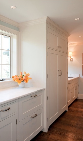
In my column, Ask Deb Nelson, a common theme people write in about is adding more storage, or creating a better use of space. When space and storage is limited you want to take advantage of every nook and cranny you have. Look for vertical space, and building things upward to add extra storage. It seems like everyone has more 'stuff' than 'space', so the first part of the equation is to get serious about editing and organizing. The next step is to look at your own space and see what you change or where you can add more storage. It got me thinking about my own house, I added floor to ceiling cabinets to add a coat closet and pantry by a side door. This is a great amount of storage and is extremely handy to have by the door. There are a number of lower cabinets under the windows too, I use these for shoes, recycling bags, tools, etc.
These are some images I had for inspiration, and I personally really like the look of a cabinet going right to the ceiling and creating more of a built-in effect. In my case I used inexpensive, 'big box' pre-made pieces that had to be customized to fit around beams and are actually 'built-in' and are attached to the wall.
Some inspiration shots below:
And in my house, when the cabinets went in, it looked like this:
And from the other direction:
BEFORE & AFTER: KITCHEN SIDE DOOR
In my kitchen there is a side entry with a charming old door. I wanted to make this a functional area – an extension of the kitchen with the BBQ and a small porch off of this side of the house.
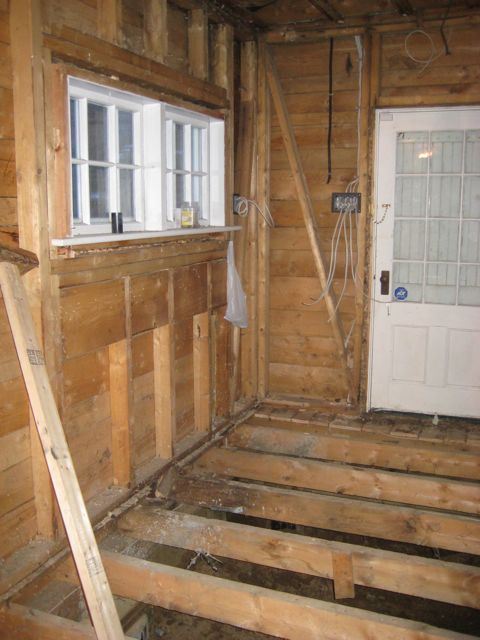
I wanted to keep the original door (I even have the old skeleton key for it), but pretty well everything else around it changed. You can see it here in the “before” picture – this is pre-renovation.
At this stage there was a wall to the right and a sink on the left with a washer. There was a drop ceiling, the floors were uneven and the great views at the back of the house weren't visible.
When the renovation started and the place was being gutted, opening up the wall on the right hand side made a huge difference to the light in the house.
This end of the house required some structural underpinning so the floors were actually completely removed as that work was done from the inside and outside of the house.
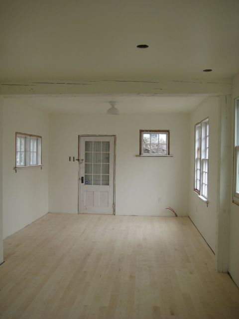
Then came a new subfloor, beams, wiring and insulation. Bigger changes are visible after the new drywall is up. Things start to feel like a house again!!
Finally the new floors are in and the cabinets and counter go in back here. There is a coat closet, pantry and the two chairs in front of the window. The sun rises here and there’s an ocean view out the window, so it’s a great place to sit in the morning.
B & A: THIS SMALL BEDROOMS POTENTIAL REVEALED!
At DND, we always love a good Before & After. There is something magical about seeing the possibility of what a room could be. When I bought my old 1844 house, there were many rooms that felt a little tired and dated. When I saw this space I wanted to lighten and brighten it up.
BEFORE
AFTER
Hereʼs what happened:
– All new walls and ceilings, although it doesn't show up in the before picture, all of the old plaster in this room was cracked and heaving on the walls and in the ceiling. New drywall and paint really changed the look.
– White paint! One of my favourites, I painted the walls, ceiling, floors and trim in white. This truly transforms a room!
– One way to instantly brighten up a space is to expose more of the windows. Removing the sheers and full length drapery panels and going to custom made linen roman shades in the windows allowed more natural light to flow in.
– Room layout: the furniture placement in the 'after' picture is very different. The bed is placed in front of the window instead of on the wall on the right. Creative space planning had to happen in this room to fit that large antique cabinet you can see in the first picture.
There are terrific water views out both these windows! Iʼm going to be switching around the furniture in this room to see if I can capture more of the view! I'll be sure to share those results on the blog later this summer.
ANTIQUE DISPLAY CABINET
This antique cabinet is a great place to display small objects. Possibly this is a piece from an old hotel – each box is numbered, so could have been where the key to each room was kept. Now makes a great place to show off some small, unique antique accessories. I'll be sharing more on those tomorrow!


