I've been thinking a lot about backsplashes these days because I need to choose one for my own kitchen, which you can see above. Typically my rule of thumb is to go with a fairly simple and quiet backsplash, but of course it completely depends ...
Read MoreBEFORE & AFTER: DOUBLE DOORS
When I purchased my old house, I wanted to add ‘new’ doors at the back of the house from the kitchen. I thought this would add charm to the space and I liked the idea of outdoor access here for carrying in groceries and things ...
Read MoreBEFORE & AFTER: FLOORS & FIREPLACE GET AN UPDATE
In this living room I had no problem painting the original brick fireplace white, along with the shelves, mantel and hearth. The walls, ceiling and trim throughout also got a fresh coat of paint. The other big (but subtle) change was having the floors redone. ...
Read MoreGREAT GALLERY WALLS: HOW TO CREATE ONE
I like the look of gallery walls, and often use them in my own spaces. The image above is from a small apartment I renovated and decorated. I find the key is making sure you have enough artwork to fill in the space, they don't look good if it's too skimpy. It's a great style, and can be an excellent way to use different frames and styles of art that you might have laying around. It can take some experimenting to get the layout perfect. I lay all the artwork out on the floor first, like a puzzle, and move things around until the overall fit looks right. From that point I choose the centre piece and hang that one first, hanging the others around that. In my opinion, it's not a perfect science. As you can see in these rooms it can be nice when colourful prints, photos and paintings are mixed together.
Sources:
Image 1: Deb Nelson Design, photo by Janet Kimber
Image 2: houseandhome.com
Image 3: lonny.com
Image 4: unknown
SMALL SPACE SOLUTION: DIY SOFA WITH STORAGE
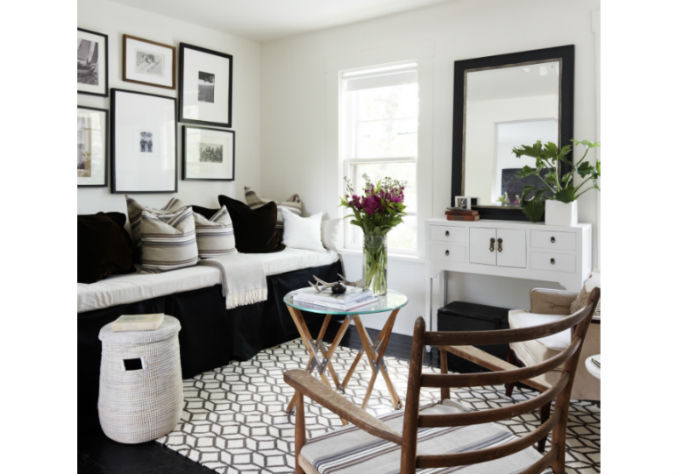
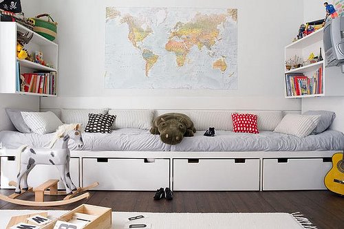
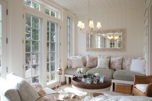
This is a small space solution, that can also work if you're in a home and looking for a multi-purpose sofa/bed/storage. When I was designing this small space above, I was looking for a way to incorporate those three elements. There are options out there you can purchase, but I didn't want to commit to keeping a piece of furniture there, I was looking for more flexibility to be able to easily move things around or change items. So I came up with the idea you see above. I used some Ikea cabinets to create a base, so there was storage, and I topped these cabinets with a board. I then made a custom foam mattress to fit on the board and covered that with linen fabric. I had looked at many of these ideas online before I came up with this idea. These were a few in my inspiration file.
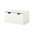
So used 3 of these cabinets from Ikea as the base, to use for storage:
And here is how it all looked finished. For the purposes of the photo shoot I covered the white fronts with a piece of black fabric, creating the look of a skirt around the base.


