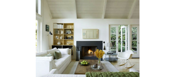
It must be the time of year – some of these chilly grey November days make me feel like drinking hot chocolate in front of the fire. I've often worked in homes with traditional, classic white fireplace mantels. In some other homes, a more unique fireplace looks better with the architecture of the house. So the image above is one that shows how a simple fireplace can work in a more modern looking, open space. Here are a few other unique looking mantels that make me want to curl up in front of the fire!
DIY: UPDATE A COFFEE TABLE
This little DIY was something I thought would be an easy change. I had this old coffee table and the brushed silver legs were feeling dated and tired. To give the coffee table a new look, I've painted the legs with a metallic paint with a bronze iridescent finish. Here is the BEFORE:
And here is the AFTER. The process of painting the legs might have taken 10 minutes and was very easy to apply. I'm on an antique bronze/brass kick, so I've been painting a few different objects which I will continue to share. I love the results!
DIY: CREATE A STYLISH PILLOW
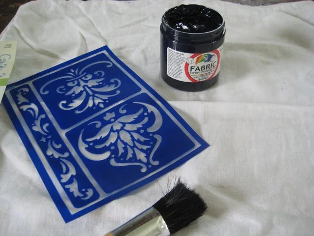
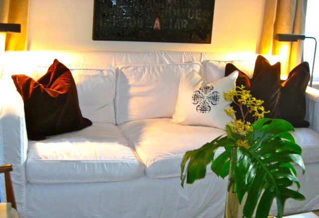
A very simple, inexpensive DIY idea is to use a stencil and fabric screen printing ink to add some pattern to a solid piece of fabric. I happened to have some white cotton pillow covers, so I decided to add some colour and pattern. It's as easy as holding the stencil on the fabric and tapping on the ink. The great part is you could use this idea for just about anything: a table cloth, place mats, napkins, pillows, etc. There are lots of different stencils and ink colours, so the options are pretty endless. Here are the pictures of my progress right up to the pillow in my living room.
DESIGN INSPIRATION: ARTWORK BY THE ANIMAL PRINT SHOP
I was looking at Domaine Home and saw this room, with this adorable artwork on the wall of a baby nursery. This is a print called wolf pup, shown below.
I was intrigued by the wolf print and found that the credit was given to an online company called The Animal Print Shop. They sell adorable animal prints. I think they are a perfect fit for a child's room, but they show their prints in a variety of rooms. This is a great resource for interesting animal artwork. I also love them in the white frames, it provides a soft backdrop and lets the animal print be the focus.
Images from: The Animal Print Shop & Domaine Home (top image)
ROUND UP: VERSATILE OVERHEAD LIGHTING
I look at a lot of lighting and recently I've really been into the West Elm Arc Mid-Century chandelier. It's a stylish fixture that is at an incredible price point. Here it is on it's own.
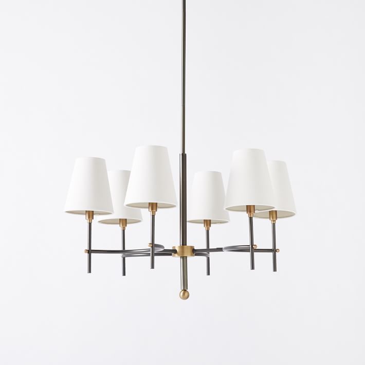
It reminds me of another overhead fixture I've recommended for several clients; the Bryant chandelier from Circa Lighting shown below. It comes in a few different colours/finishes and 2 different sizes. It has a classic look that can fit work with many different styles.
I've always liked it in this room from Domino magazine, this looks like it is in the bronze finish.
Here is the fixture in the hand rubbed antique brass finish.
And now Circa has this version, called Farlane, which also has a similar look but is a higher price point.


